A Hair Dryer for your Bad Hair Days

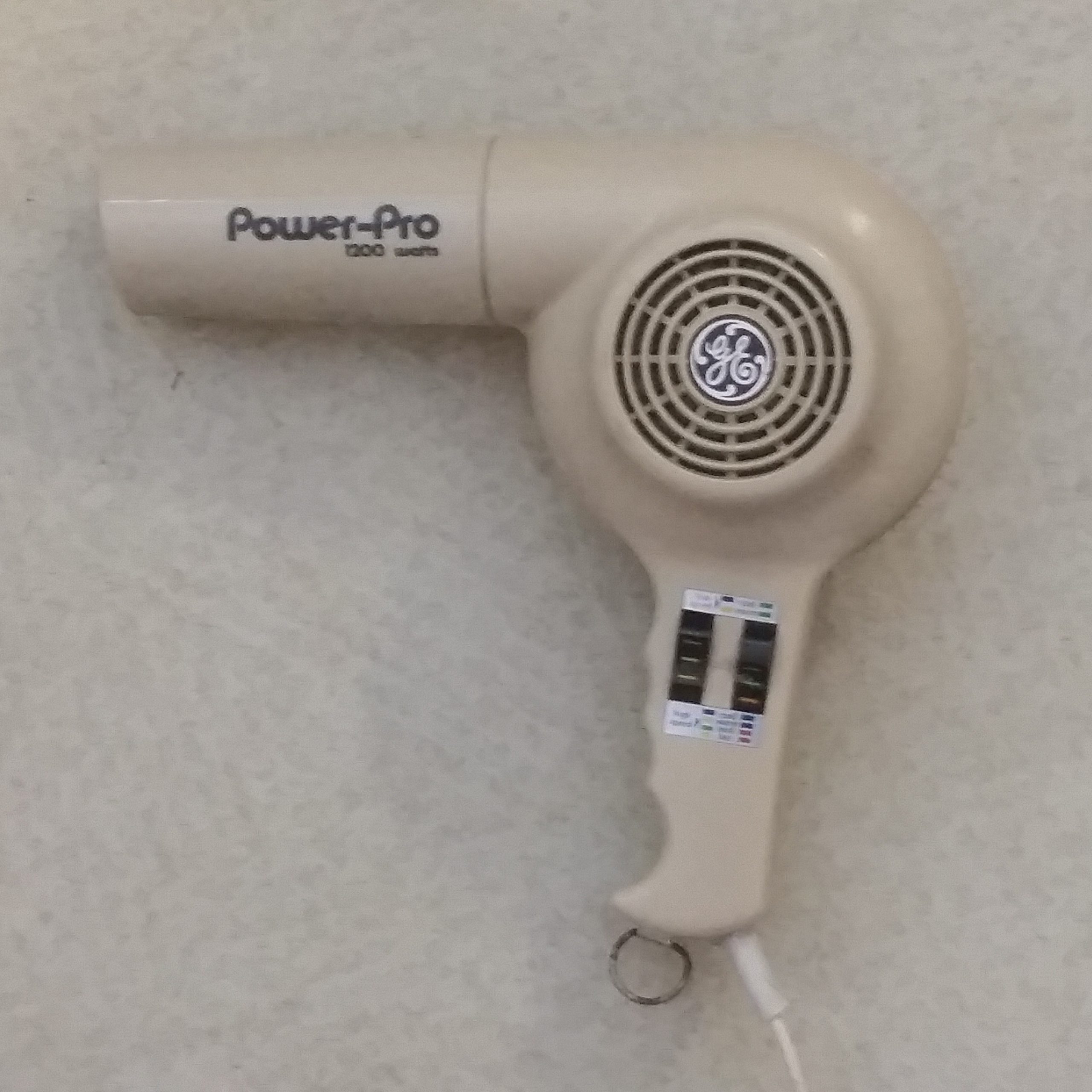
This hair dryer (from the ’70’s) has the most confusing control labels I’ve ever seen. It takes quite a bit of explaining, it’s so bad.

GE Power-Pro Hair Dryer (from the ’70’s)

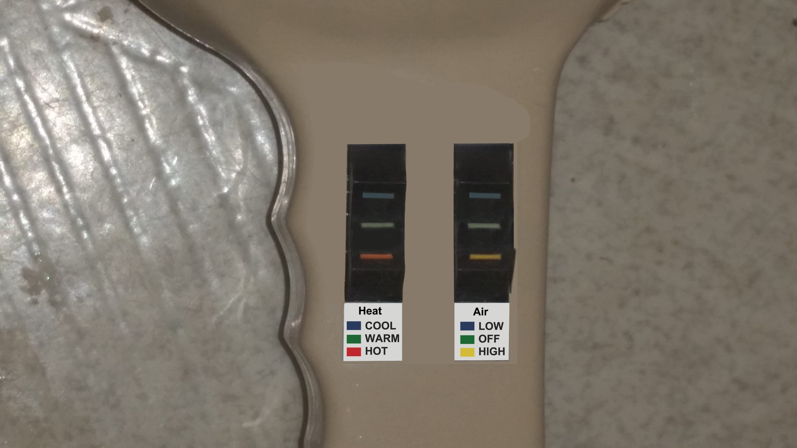
The hair dryer has two three-position switches: UP, MIDDLE, & DOWN.

Double-MIDDLE = Off. But let’s see how they define & label the nine combinations.

How they labeled the controls

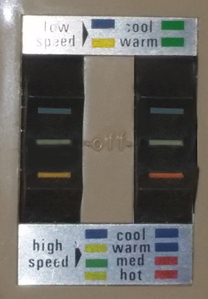
The Left switch (BLUE-GREEN-YELLOW) controls the heat level.
• BLUE (up) = Cool
• GREEN (middle) = Medium, whatever that means (or Off)
• YELLOW (down) = Warm (or Hot, on High Speed)

The Right switch (BLUE-GREEN-RED) controls the air speed.
• BLUE (up) = High
• GREEN (middle) = Low (or Off)
• RED (down) = High

Note that ANYTHING OTHER THAN MIDDLE means high for the right switch.

But it gets worse … Instead of labeling the two switches as “Heat” & “Air”, they label the color combinations, eg: GREEN+RED=“Medium Heat, High Speed.”

Then it gets even worser … they label the Air options (controlled by the right switch) on the left, and the Heat options (controlled by the left switch) on the right. (So in the previous example, GREEN+RED gets labeled “High Speed, Medium Heat”, not “Medium Heat, High Speed”.)

So all of the thought that went into having the switches mean anything individually, gets tossed out the window, and you have to think in terms of meaningless color combinations.

AAAAaaaauuuugggghhh!

Plus: Only seven of the nine possible combinations are labeled. And two of them (“High+Warm” & “High+Medium”) as far as I can tell are synonymous.

MY SUGGESTION

The six combinations (besides OFF) that you need are (Cool-Warm-Hot) x (Low-High). If the switches were labeled (and wired) like this, there’d be no problem & no need for color combination codes.

My proposed labeling

Too Many Barcodes!

I was at CVS the other day, using the self-checkout. When I scanned this thermometer, the light started flashing, and I got a message like “This item requires additional assistance. Please wait.”

When the cashier (she had to leave her post to help me) came by, she explained that the machine had scanned the wrong barcode. This item has THREE BARCODES! (Plus two more numbers above & below.)

That’s not a problem with the machine, it’s a problem with package design.

Use Which Door Where?

In keeping with the title of this blog, in this post, I am going to contrast a Good UX with a Bad UX. Let’s start with the bad.

If you thought I was going to complain about the spelling of the word “Other”, … well, you wouldn’t be completely wrong. But the point I want to make here is “How little effort would have been needed to add an arrow to this sign?”

Is the “OTHE DOOR” to the left? To the right? Up a flight of stairs?

This hotel understands:

Veritas Hotel in Harvard Square

You don’t need Google Maps to tell you where Remington Street is!

Thanks for the Redundant Sub-titles

Someone at Amazon Studios seems not to understand the concept of sub-titles.

Some of them are:

The first thing you see.

So the deaf & hard-of-hearing know what year it is.

This one was actually helpful, but that’s not the point.

(These are from the film The Electrical Life of Louis Wain, starring Benedict Cumberbatch as Louis Wain.)

Germ-y?

A bottle of Jermee brand hand sanitizer

Perhaps this wasn’t the best brand name idea for a hand sanitizer?

Reusable Sharps?

In my humble opinion, formatting the text as

REUSABLE

SHARPS CONTAINER

would have been a lot less ambiguous. And less dangerous!